Brand Identity, Packaging, Social Media Management
December 21, 2021
“ We vow to keep the integrity of our products and drive the highest quality by building trust and loyalty with our fishermen and expanding collaboration on the island, within respect of their traditions and family values.”
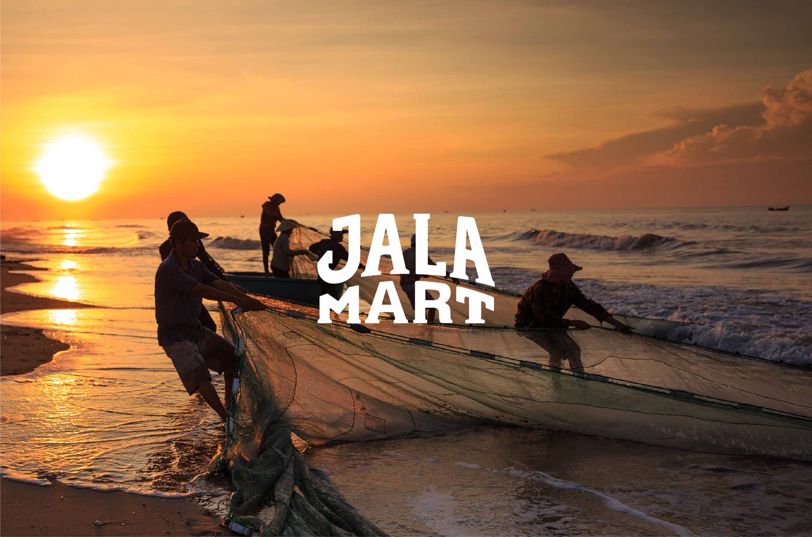
Jalamart is a brand conceived and shaped thinking about providing premium frozen seafood products to the masses while also ensuring the welfare of local fishermen in Indonesia, driven by the goal of empowering small-scale local fishing communities while practicing sustainable work ethic and preserving the ocean, as well as providing affordable and fresh seafood produce for local households. The word Jala in Indonesian means the net, representing an interweaving of thread that integrates a diverse community of fishermen as well as the consumers into a single entity. One fisherman alone can be fragile, but multiple fishermen bonded together are strong like an intertwined web. Following this philosophy, the owners of the company set up a group of fishermen in Talaud Islands to empower each other and unite asa community to scale up their economy.
My agency and I helped Jalamart in identifying their fundamental values and how to translate that in a form where everyone involved could enjoy and benefit.Jalamart is more than just a commercial brand; it’s a social enterprise.
Goals
Creating a versatile logo and identity system design that can be used throughout various platforms and media.
Translating the brand vision into visual in a style that is familiar and amicable to the local market while still reflecting the premium quality of the product.
Creating packaging design that is sustainable and eco-friendly, avoiding single usage materials use.
Promoting the brand awareness using social media management.
Target Market
Female & male, Jakarta & Java area, Low to upper middle class.
Housewives/housedad who wants to provide healthy and affordable meals to their family without having to go to traditional market. Health enthusiasts, high paced working individuals who need healthy and practical meals, uses social media.
The benchmark for Jalamart comes from commercial market chains and consumer goods targeting all layers of Indonesian market. The research shown the preference for bold color usage, with graphic elements placed in simple lockup, creating memorable impression, quick brand recall, as well as approachable and can be used on various media.
The overall design style was created to embody the company’s values by using a custom-made logotype inspired by the vernacular typeface commonly used by local street vendors. Inspirations are also taken from various elements used by fishermen boats, notably seen the choice of colors which derives from the vibrant paint seen in traditional Indonesian fishermen’s boats, which works well with the overall branding, creating an eye-catching and memorable impression for the logo when applied to various mediums.The aim of using familiar everyday object is to create a friendly brand image that is able to cater to the need of families and individuals alike, straying away from the usual premium impression that most Jalamart’s competition, while still maintaining a level of sophistication to maintain the brand’s trustworthiness in products quality.
Logo Development
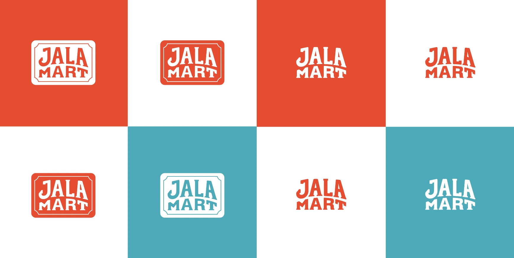
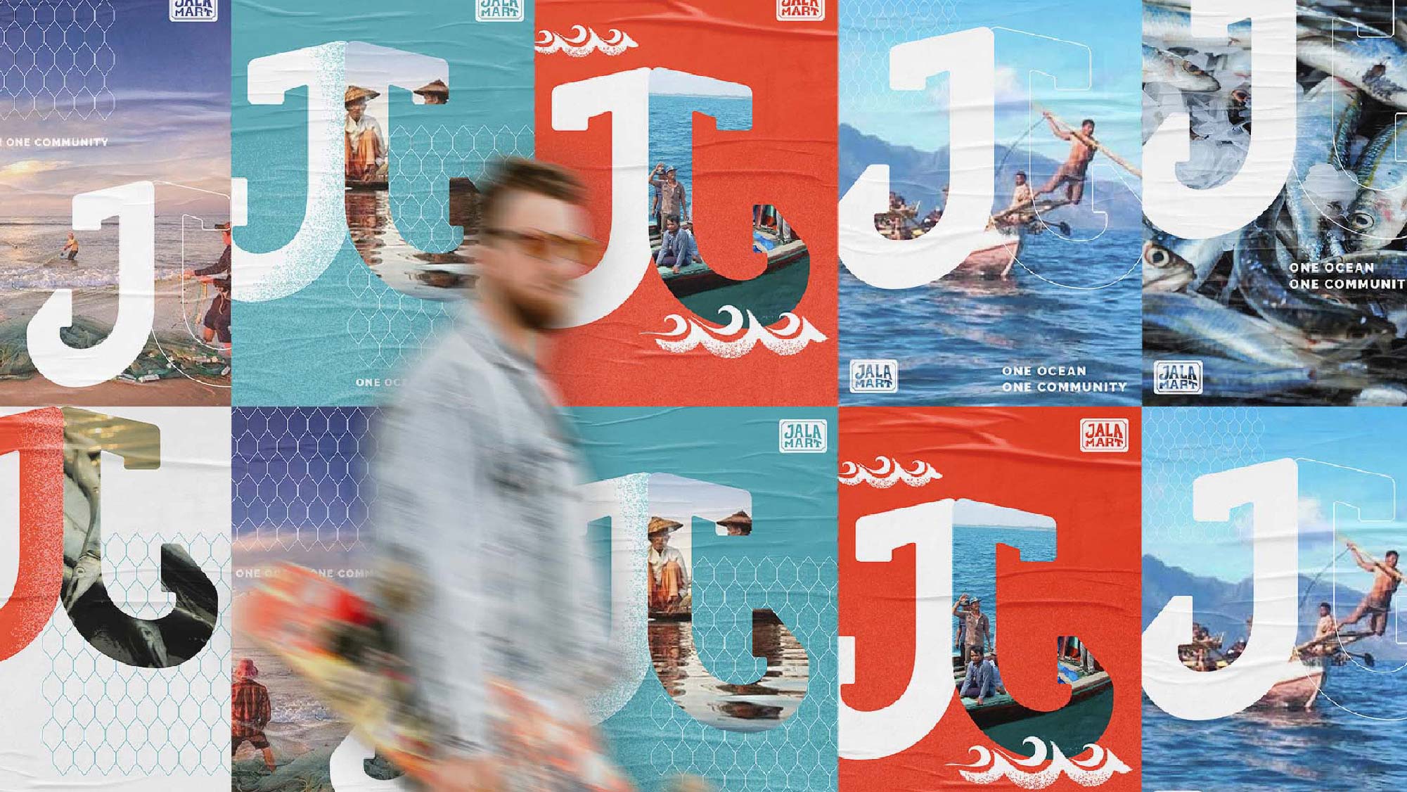
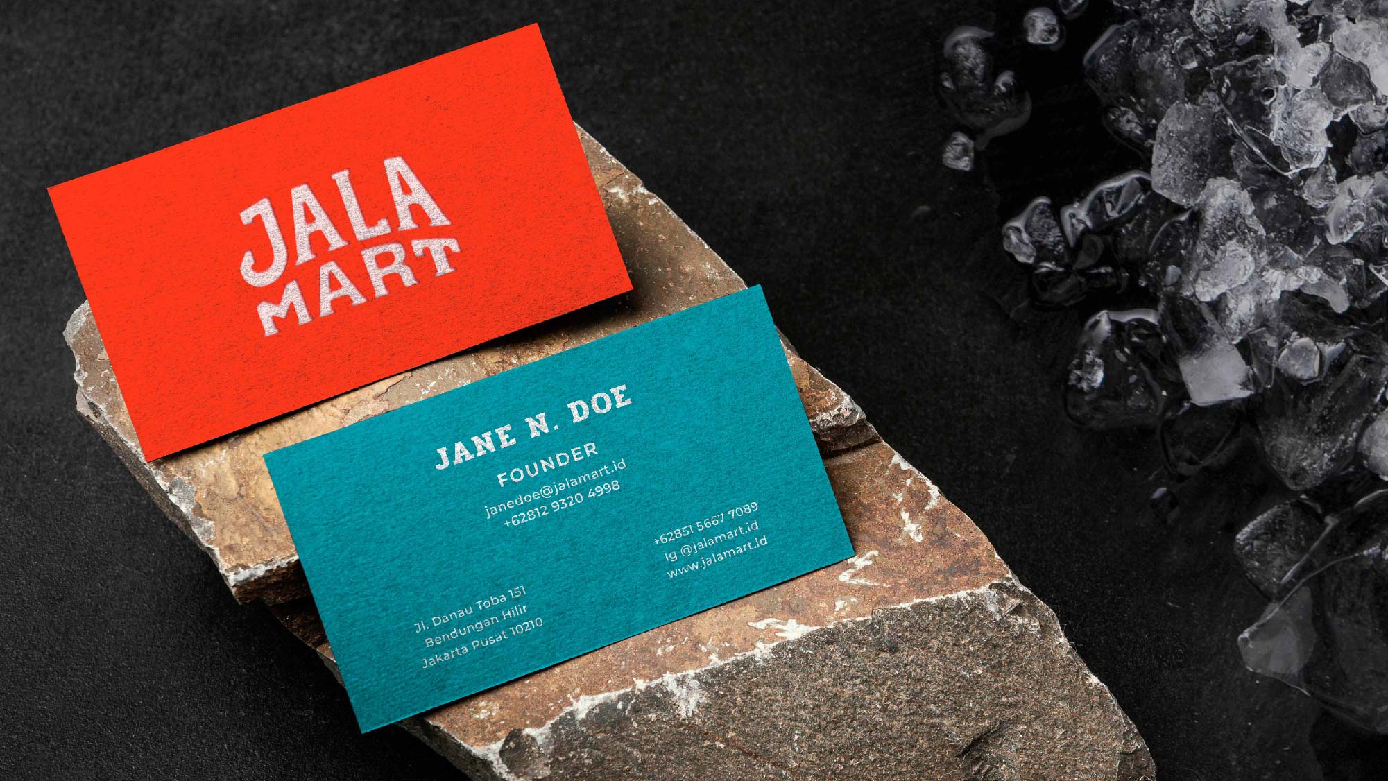
Taking the research for the benchmark’s logos, the design for the logomark was created so that it can both be placed in a simple lockup, act as a stand alone logo, memorable and easily read from a distance. The logotype was hand drawn, inspired still by the vernacular typeface used by the street vendors, and then digitized and fine-tuned digitally. The J mark serves as a subtle cue to the shape of an anchor. Subsequently, the color selection derives from the vibrant paint seen in traditional Indonesian fishermen’s boats, which works well with the overall branding, creating an eye-catching and memorable impression for the logo when applied to various mediums.
Bold colors are used to enhance the brand distinctive image. The red and white inspired by the color of Indonesia, while the blue and coral colors are reminders of the ocean and the fishermen’s boats. The complimentary visual elements take cues from the meaning of Jala itself which is the fishing net. Thus resulting in a net like pattern, created in a straightforward shape to inspire the brand’s authenticity, to be used in various applications.
Identity Applications
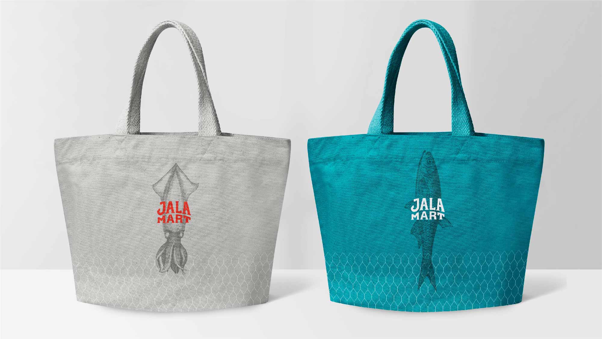
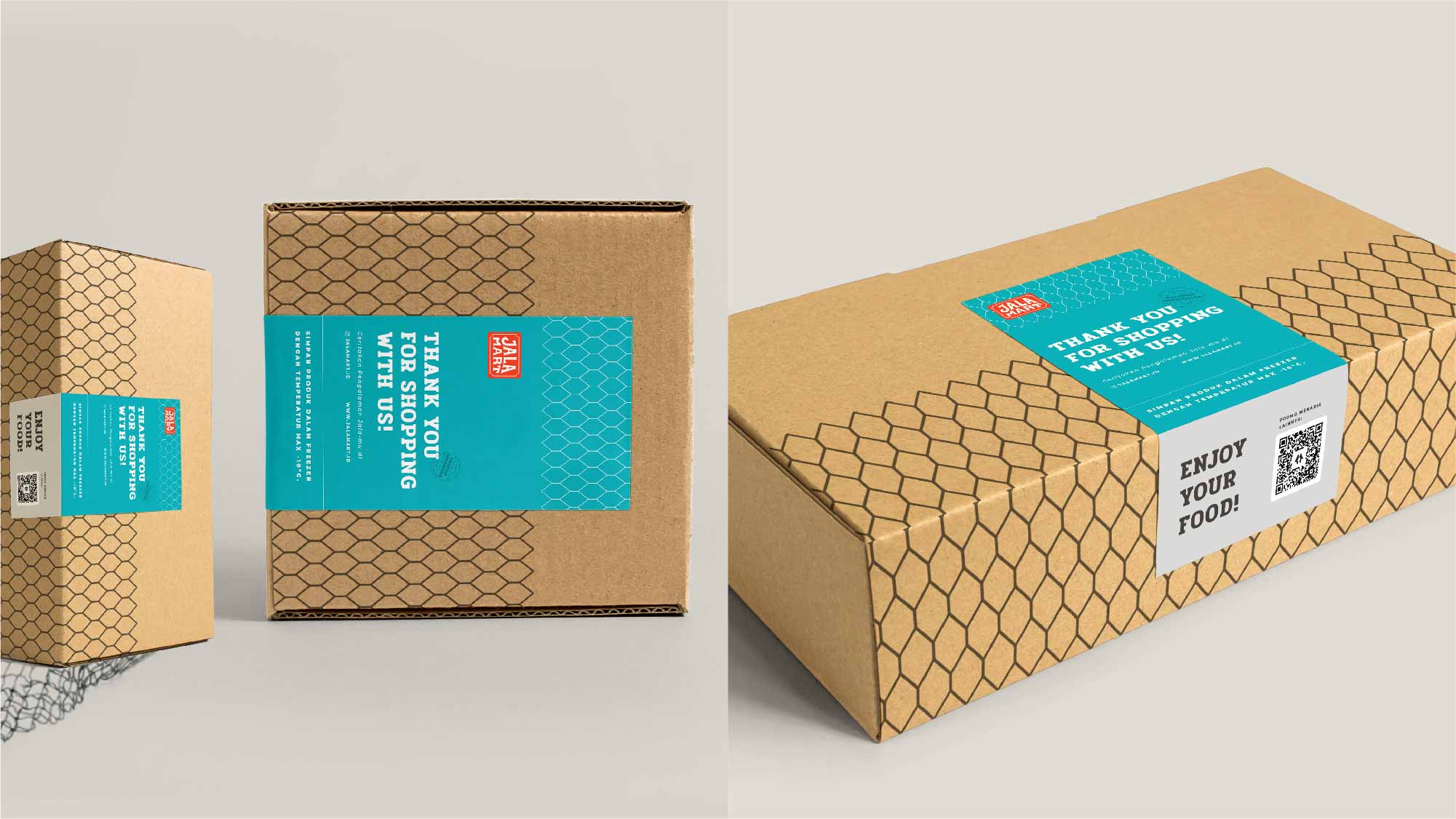
The vision of Jalamart for its consumer is to provide affordable local seafood products that is just a stone thrown away, available anytime, anywhere, lessening the hassle of going to traditional markets. While the products can be found in e-commerce websites, they are also available through traveling bicycle-cart traveling in residential neighborhoods.To promote sustainability, for a predetermined amount of purchase, Jala’s consumers will get a free waterproof multi-purpose shopping bag, which can also be bought separately. Additionally, the shipping box uses coagurated cartoon, keeping in mind that the shipment must be done in a single day delivery, which is readily offered on all e-commerce platforms in Indonesia.The J logo mark may be employed in multiple fashions; one of which as a placeholder on promotional materials, such as posters and banners, bringing into mind Jalamart’s vision to become a platform that anchors down and unites local artisanal fisheries with the wider Indonesian market.
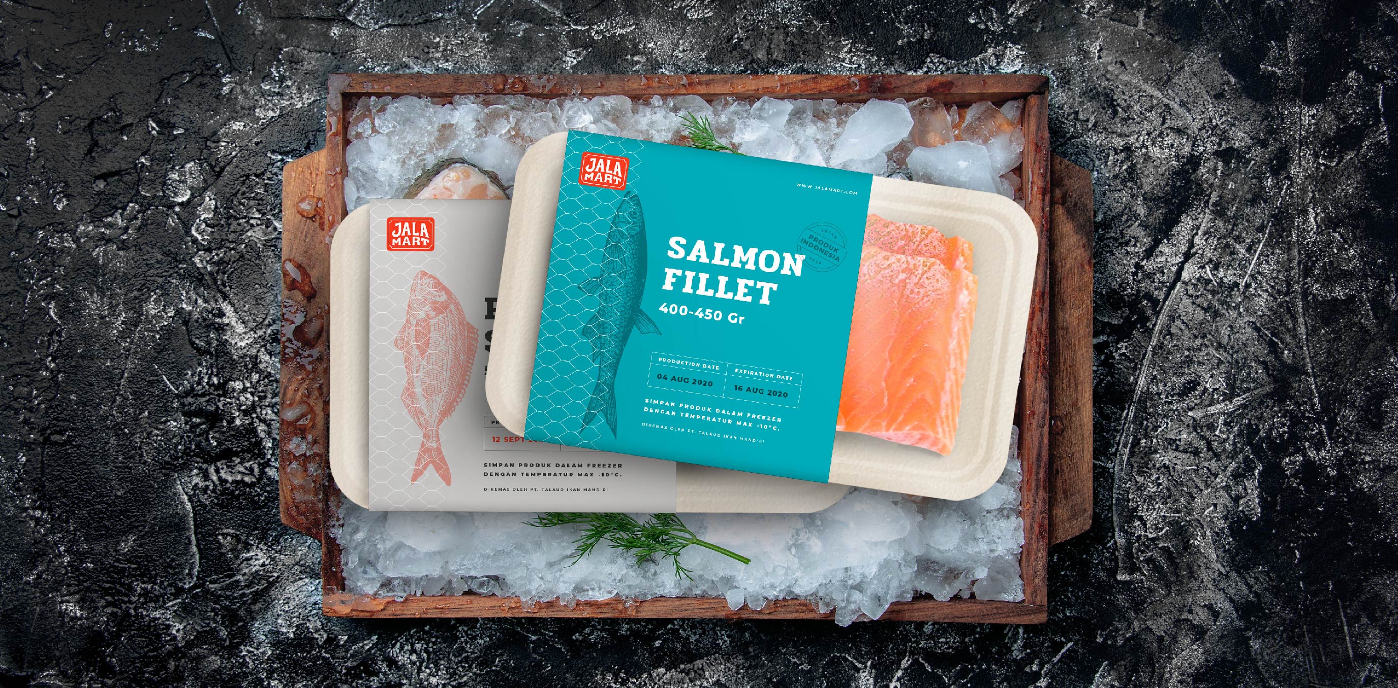
A Sustainable Packaging
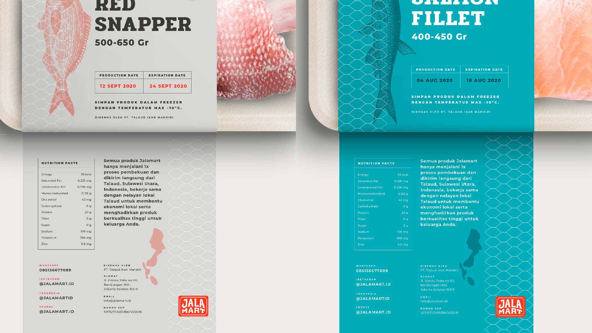
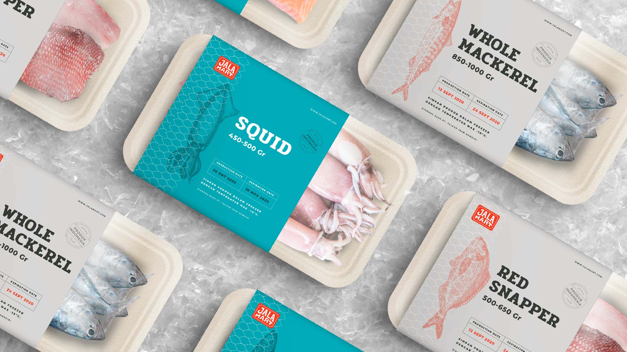
The seafood trays, as an often single-use method of packaging, are created from an eco-friendly material to avoid plastic waste. Using waterproof bagasse and a plastic cover made from seaweed as a way to practice sustainability. The tray can be reused again to keep the products frozen. The readability of the packaging is taken into consideration too. Especially for the older target market. Product variant, the expiry date, the weight per portion of the product are easily spotted at first glance. The nutrition facts and the story of the product are placed on the backside.
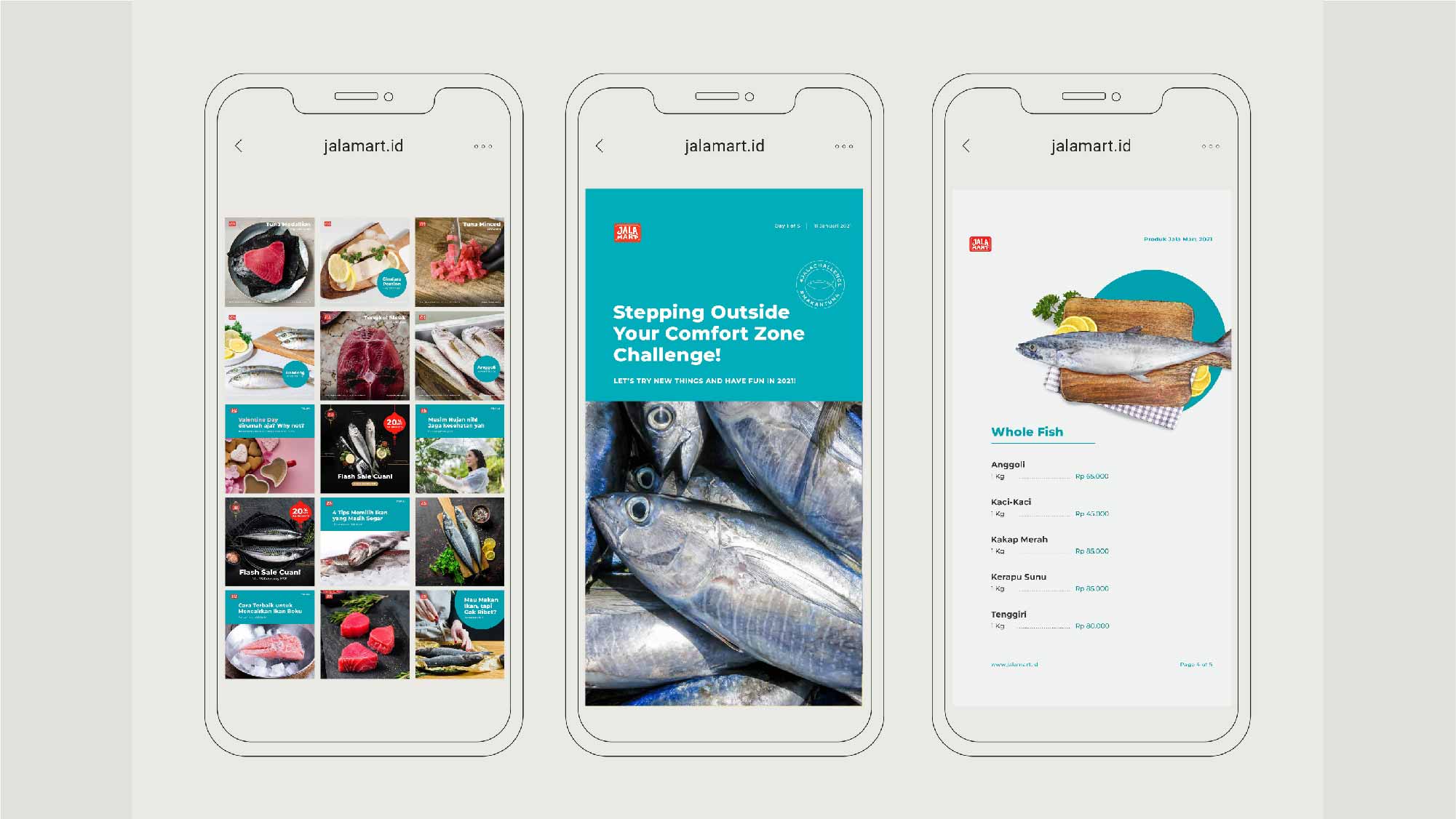
Social Media Management
We managed Jalamart Instagram account from 2020 to 2021, providing both the social media conent as well as the creative direction and design. Through its social media, Jalamart as a brand aimed to give value to its consumers by educating them not only on Jalamart’s own products, but also about seafood in general, package in an exciting and relatable information, especially for housewives and individuals new to cooking seafood products. We created campaigns about how to cook recipes from a single fish type, as well as support in ads management.
Brand Identity, Packaging, Social Media Management
December 21, 2021
“ We vow to keep the integrity of our products and drive the highest quality by building trust and loyalty with our fishermen and expanding collaboration on the island, within respect of their traditions and family values.”
Jalamart is a brand conceived and shaped thinking about providing premium frozen seafood products to the masses while also ensuring the welfare of local fishermen in Indonesia, driven by the goal of empowering small-scale local fishing communities while practicing sustainable work ethic and preserving the ocean, as well as providing affordable and fresh seafood produce for local households. The word Jala in Indonesian means the net, representing an interweaving of thread that integrates a diverse community of fishermen as well as the consumers into a single entity. One fisherman alone can be fragile, but multiple fishermen bonded together are strong like an intertwined web. Following this philosophy, the owners of the company set up a group of fishermen in Talaud Islands to empower each other and unite asa community to scale up their economy.
My agency and I helped Jalamart in identifying their fundamental values and how to translate that in a form where everyone involved could enjoy and benefit.Jalamart is more than just a commercial brand; it’s a social enterprise.
Goals
Creating a versatile logo and identity system design that can be used throughout various platforms and media.
Translating the brand vision into visual in a style that is familiar and amicable to the local market while still reflecting the premium quality of the product.
Creating packaging design that is sustainable and eco-friendly, avoiding single usage materials use.
Promoting the brand awareness using social media management.
Target Market
Female & male, Jakarta & Java area, Low to upper middle class.
Housewives/housedad who wants to provide healthy and affordable meals to their family without having to go to traditional market. Health enthusiasts, high paced working individuals who need healthy and practical meals, uses social media.
The benchmark for Jalamart comes from commercial market chains and consumer goods targeting all layers of Indonesian market. The research shown the preference for bold color usage, with graphic elements placed in simple lockup, creating memorable impression, quick brand recall, as well as approachable and can be used on various media.
The overall design style was created to embody the company’s values by using a custom-made logotype inspired by the vernacular typeface commonly used by local street vendors. Inspirations are also taken from various elements used by fishermen boats, notably seen the choice of colors which derives from the vibrant paint seen in traditional Indonesian fishermen’s boats, which works well with the overall branding, creating an eye-catching and memorable impression for the logo when applied to various mediums.The aim of using familiar everyday object is to create a friendly brand image that is able to cater to the need of families and individuals alike, straying away from the usual premium impression that most Jalamart’s competition, while still maintaining a level of sophistication to maintain the brand’s trustworthiness in products quality.
Logo Development
Taking the research for the benchmark’s logos, the design for the logomark was created so that it can both be placed in a simple lockup, act as a stand alone logo, memorable and easily read from a distance. The logotype was hand drawn, inspired still by the vernacular typeface used by the street vendors, and then digitized and fine-tuned digitally. The J mark serves as a subtle cue to the shape of an anchor. Subsequently, the color selection derives from the vibrant paint seen in traditional Indonesian fishermen’s boats, which works well with the overall branding, creating an eye-catching and memorable impression for the logo when applied to various mediums.
Bold colors are used to enhance the brand distinctive image. The red and white inspired by the color of Indonesia, while the blue and coral colors are reminders of the ocean and the fishermen’s boats. The complimentary visual elements take cues from the meaning of Jala itself which is the fishing net. Thus resulting in a net like pattern, created in a straightforward shape to inspire the brand’s authenticity, to be used in various applications.
Identity Applications
The vision of Jalamart for its consumer is to provide affordable local seafood products that is just a stone thrown away, available anytime, anywhere, lessening the hassle of going to traditional markets. While the products can be found in e-commerce websites, they are also available through traveling bicycle-cart traveling in residential neighborhoods.To promote sustainability, for a predetermined amount of purchase, Jala’s consumers will get a free waterproof multi-purpose shopping bag, which can also be bought separately. Additionally, the shipping box uses coagurated cartoon, keeping in mind that the shipment must be done in a single day delivery, which is readily offered on all e-commerce platforms in Indonesia.The J logo mark may be employed in multiple fashions; one of which as a placeholder on promotional materials, such as posters and banners, bringing into mind Jalamart’s vision to become a platform that anchors down and unites local artisanal fisheries with the wider Indonesian market.
A Sustainable Packaging
The seafood trays, as an often single-use method of packaging, are created from an eco-friendly material to avoid plastic waste. Using waterproof bagasse and a plastic cover made from seaweed as a way to practice sustainability. The tray can be reused again to keep the products frozen. The readability of the packaging is taken into consideration too. Especially for the older target market. Product variant, the expiry date, the weight per portion of the product are easily spotted at first glance. The nutrition facts and the story of the product are placed on the backside.
Social Media Management
We managed Jalamart Instagram account from 2020 to 2021, providing both the social media conent as well as the creative direction and design. Through its social media, Jalamart as a brand aimed to give value to its consumers by educating them not only on Jalamart’s own products, but also about seafood in general, package in an exciting and relatable information, especially for housewives and individuals new to cooking seafood products. We created campaigns about how to cook recipes from a single fish type, as well as support in ads management.