
Pavettia Skincare
Pavettia Skincare is a brand with a vision to incorporate the best nature can offer into daily skincare routine. The ingredients are directly sourced from their own plantation in West Java, choosing only the best quality materials, ensuring a sustainable and purely organic products without additional chemicals.


The illustrations were hand drawn and digitally colored, inspired from botanical drawings. White was chosen as the base color to give a clean clinical look and further highlights the logo and illustrations. There were two type of bottles; a pump and a spray, while a dropper bottle was used for the serum.

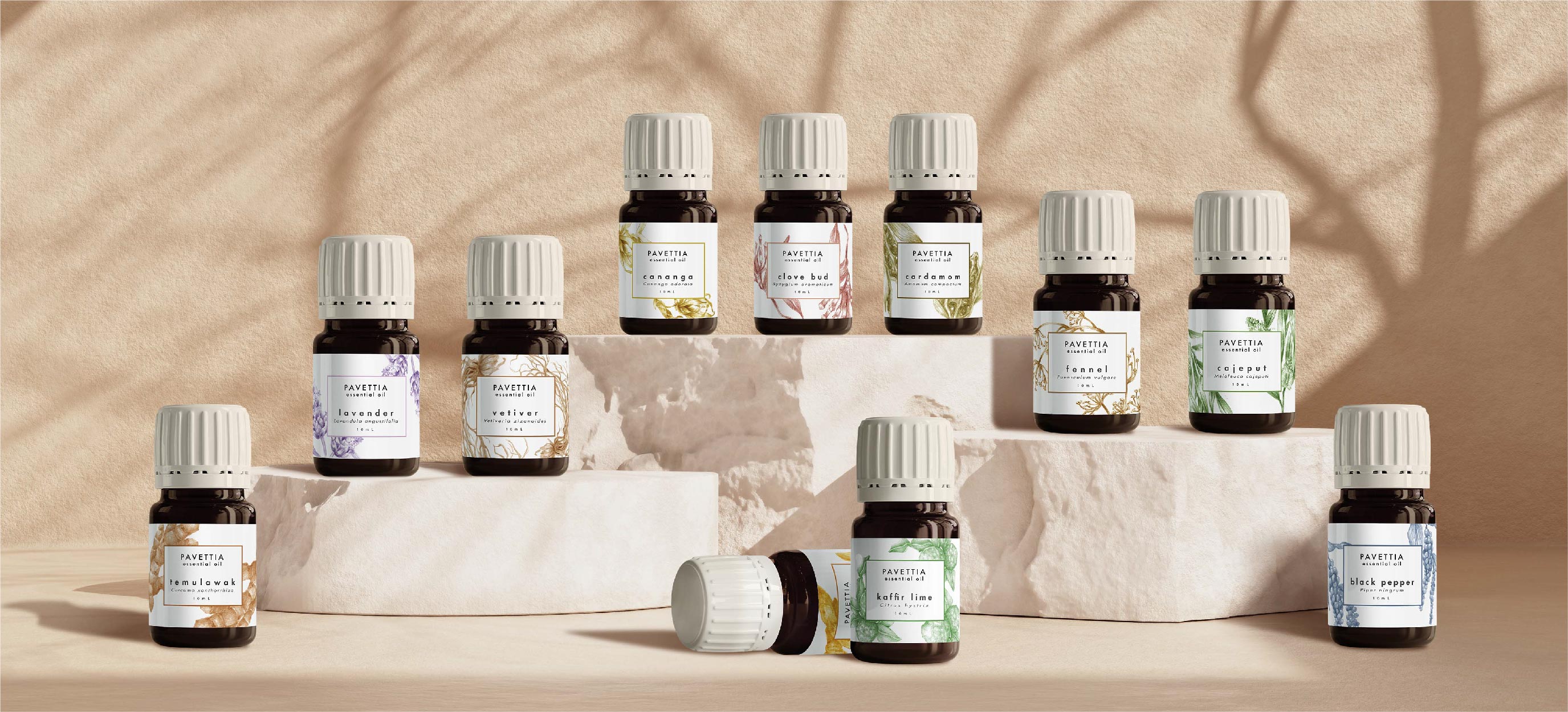

Three illustrations were initially made and as the brand grow, we added a total of 15 illustrations into the essential oils variants. As a new line of product and taking the size of the bottle which was considerably smaller into consideration, the style of coloring switch from fully color botanical drawing into a simpler single color semi-realistic illustrations. This allowed for a repeated use on the label, creating an impression of the label itself being in color and made it easier for the consumer to differentiate each variants.

Pavettia Skincare believes that nature is the answer for having healthy skin, and being able create an identity and packaging design for this beautiful vision that can withstand the test of time was our greatest delight.

The owner of the brand has had difficulty finding the right organic products that could suit her skin type. Even when labeled as organic, often the product was still infused with extra chemicals, which may cause breakouts to truly sensitive skin. Thus, Pavettia was born as an alternative to this concern, initially a homemade product consisting of only two variations of cleanser and toner, and a vitamin C serum.
The owner wanted both the logo and packaging to portray an impression of simplicity, showing that it was an organic product which uses high quality natural ingredients. We create a logo that is straightforward and effortless in its application. The highlight was to be on the packaging itself, on the illustrations of the ingredients.
CREDITS
Design
Silvana Sari
Karrisa Indraiasa
Illustration
Silvana Sari
Photography
Karrisa Indraiasa


